DDSA – Transforming a Disjointed Experience Into a Seamless, Unified Modern App
Vite
React
Figma
Typescript

Description
My Role
Platform
Web
Client/Owner
Duration
Problem Overview
Imagine being an agent, or just anybody eager to find work, but to reach your job search dashboard you had to leave the landing page, move to another subdomain, and then log in all over again. The whole process broke your flow, felt repetitive, and became unnecessarily frustrating.
It wasn’t just a user issue either. For the company, tracking became difficult, context was constantly lost, and knowing who did what and when turned into a guessing game.
DDSA (Digital Direct Sales Agent) was created to connect agents with field agents in Nigeria’s job-tech space. The mission was bold, tackling unemployment at scale, but the product itself had its struggles. The homepage and dashboard looked like two different apps with no consistent design language. Under the hood, the codebase leaned on outdated practices that slowed things down and made the app harder to maintain. With no clear structure or documentation, every new developer had to figure things out from scratch.
For both users and developers, DDSA felt fragmented and inefficient, holding back its potential to deliver a smooth, modern, and scalable experience.
Solution Process
While these problems were easy to spot, solving them the right way required an iterative approach. I employed the framework below
- Measure
- Analyse
- Change
Measure

The first step was to observe and measure the pain points. Joining the team, I asked team members to walk me through the app, and I also tested the user flow myself and confirmed how much friction came from moving across subdomains. I also looked at performance metrics and developer handover notes to see how much time was wasted because of poor documentation and inconsistent code.
Analysis & Insights
Next, I analysed to find the root causes of the problems from both the design and engineering perspective. After organising the findings, I turned them into insights that guided the changes.
Design Insights
1. The design lacked a single direction because there was no unified source of truth.
2. The Navigations were confusing and it took extra knowledge for users to complete the job flow.
Code Insights
1. There were wasted renders, because unrelated items were grouped into 1 large context
2. Developers morale was low, reflected in the choice to build a custom router that wasn’t intuitive
3. There was strict governance on packages, instead of guidance on what to install and what not.
Change
After measuring and analysing the issues, I focused on making changes that addressed both design and engineering gaps.
Changing the design
I began making changes to address each insight, as the goal was to do gradual improvement
1. Systemising the Design
I utilised Figma variables, This introduces a token system, which has 3 steps
- Scope: The type of variable to be used, e.g Color, Text, Surface and more
- Name: The name of variable, e.g Primary, Secondary.
- Identifier: A Number of string, e.g Default, 200, 200, etc.
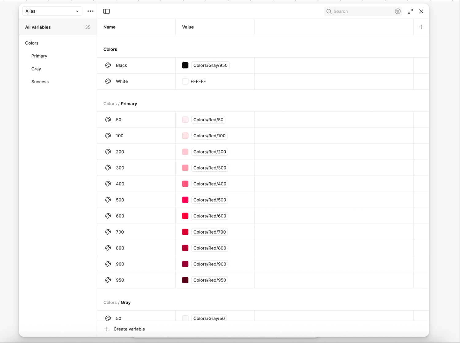
Putting everything makes it look like this, Color/Primary/200.
Scoping the variables ensured that a variable only came up where it was meant to be used. This reduced inconsistency and gave the team a single source of truth for UI decisions.
2. Improving Find-ability
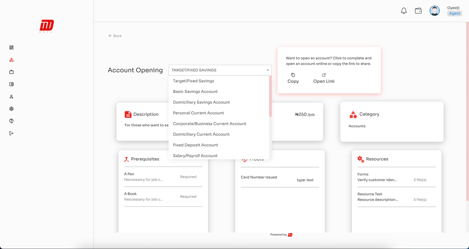
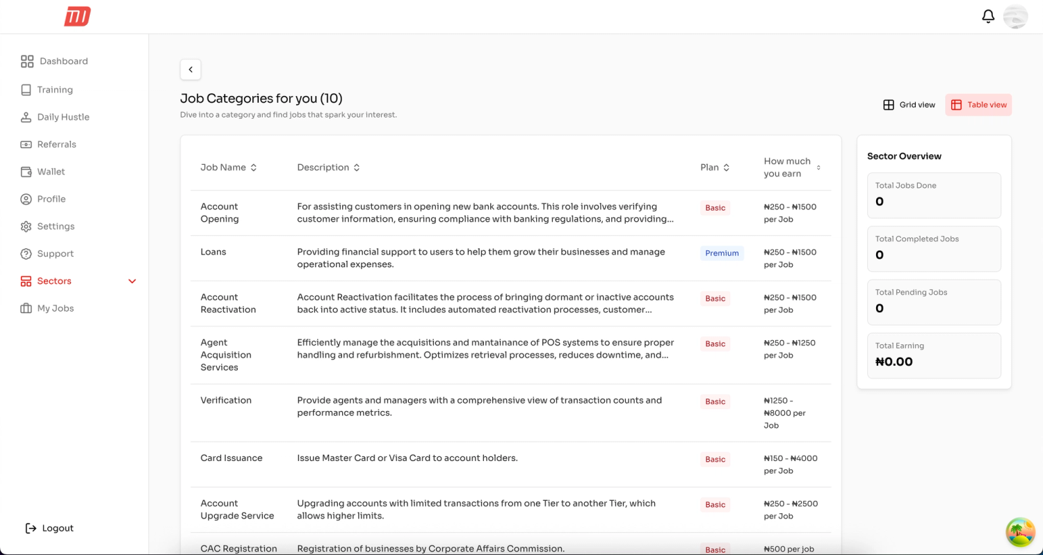
- I introduced a grid and table view
- Categorised items in ways that makes logical sense for people not in the domain
Before: The Different types of jobs was hidden with a drop down, this was so difficult to spoilt before now
After: The Different types of jobs is now visible for users to spot and select the one they'd like to do
Changing the Code
On the engineering side, I rewrote the application to solve the following problem
1. Tooling & Tree-shaking
The old codebase was bootstrapped with Create React App, which used Webpack that wasn’t good with tree-shaking. I introduced Vite to solve this problem, which helped reduce bundle size and kept the application lightweight.
2. Context Synchronisation
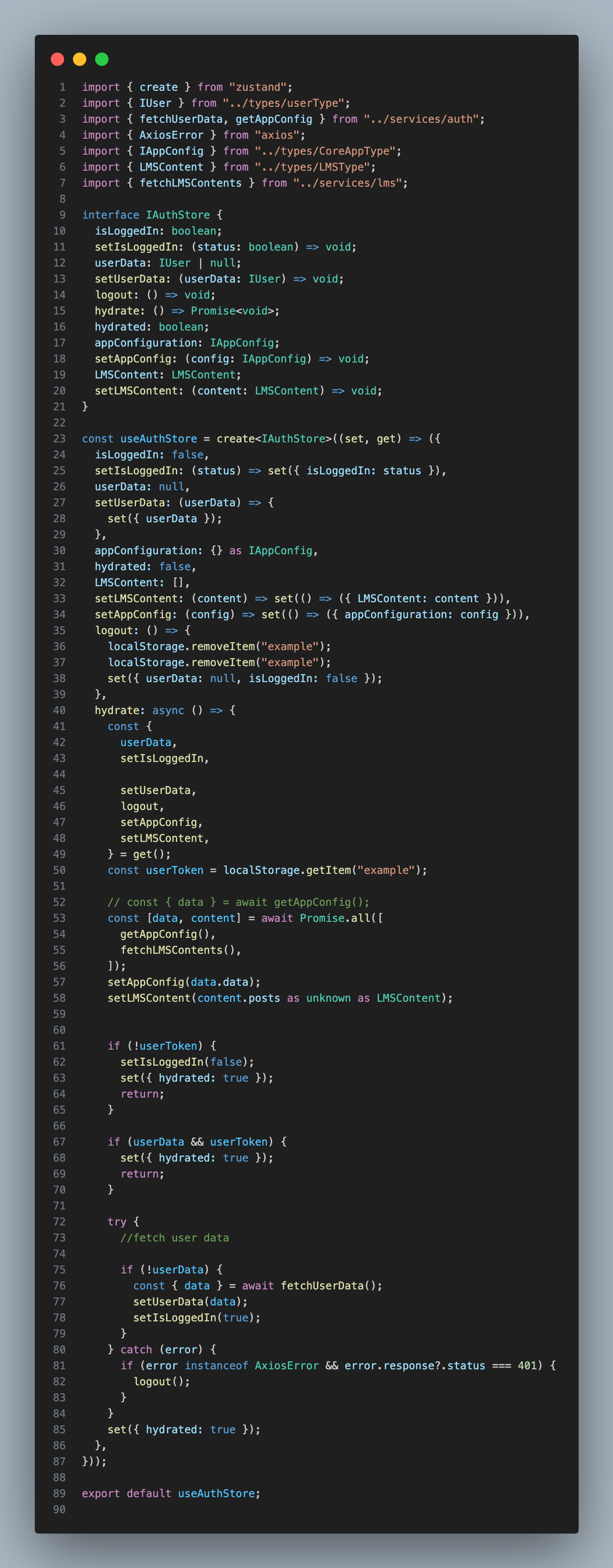
I merged the landing page and the dashboard codebases. This made it easy to detect the context of who was logged in, who did what, and what they did in one place. It also helped determine returning users and fresh users.
3. Modern Practice
Merging the entire application meant more JavaScript was being downloaded to the user, which could slow down load time. To address this, I opted for dynamic imports, which allow JavaScript to be downloaded on request. I ensured that suspense was used to show a quick loading element.
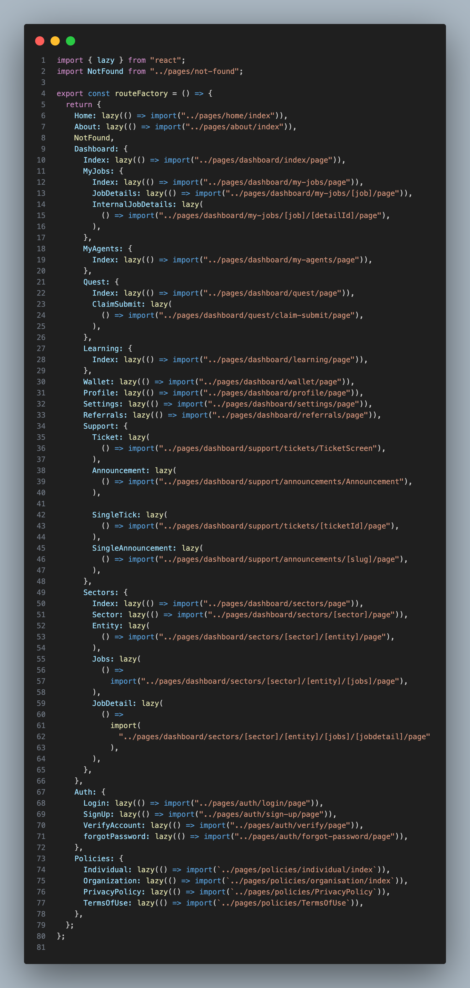
4. Improving Navigation
A good developer experience begins with using tools developers already know. I opted for React Router, as the custom location change event was too complex. Changing this helped improve developer willingness.

5. Cleaner Code
The older codebase was written with a focus only on banking sector. Adding more sectors meant duplicating the code and changing things. I adapted the code to work for new sectors and even sectors we were yet to enable.
Outcome
The result of these changes was a faster, unified, and more user-friendly application. Users could now log in once and seamlessly access their dashboard without breaking their flow. The consistent UI created trust and familiarity, while performance improvements made the app feel modern and responsive.
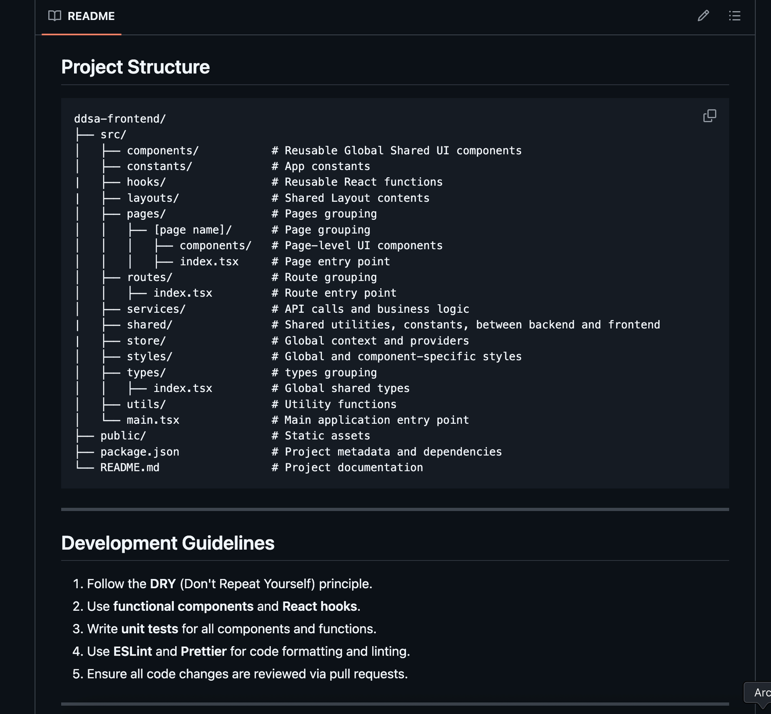
For the company, developer onboarding became easier with proper documentation and a structured codebase, while governance allowed the team to scale the app more confidently.
Improvements
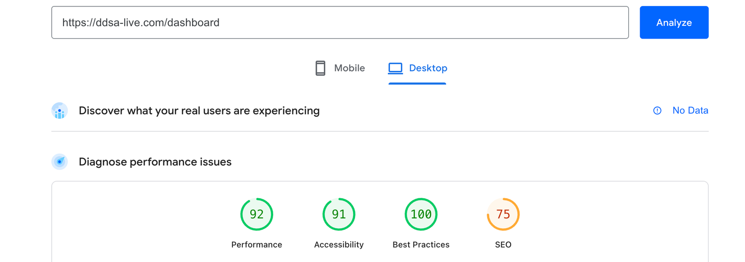
Improved Performance from 12% to 92%
Improved user context synchronisation
Before: Clicking on login would open a new subdomain, which creates a false user expectation

After: The Navbar now shows a real context for a user, Takes them directly to their dashboard as they would expect

Improved User Onboarding
Before: The term Agent, Super Agent and Ambassador was vague, this led to users signing up for the wrong roles
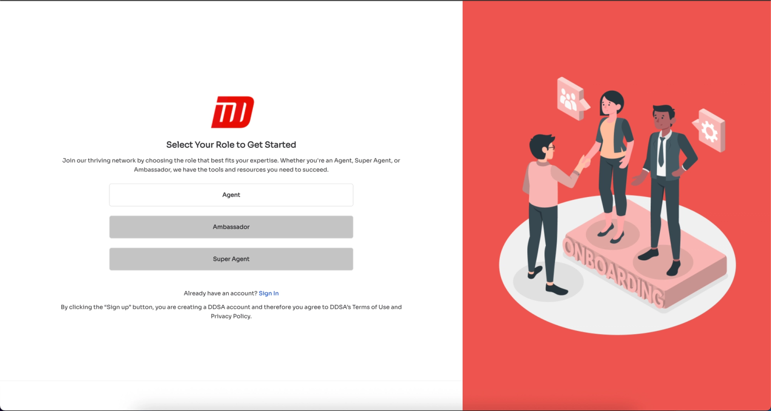
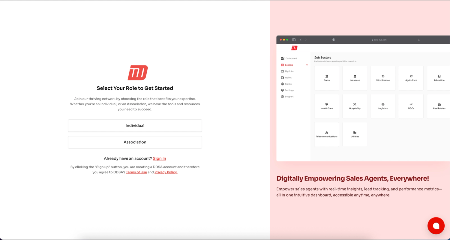
After: I improved this by reducing roles to how the business interacts with the users, which includes individuals and associations
Improved Onboarding Documentation
Change Request
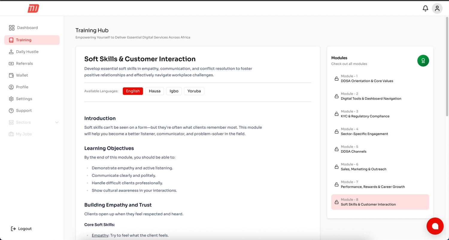
Introduce Training for Agents
To ensure data confidentiality, I added training for agents in multiple Nigerian languages, managed by content management system to ensure ease-ability
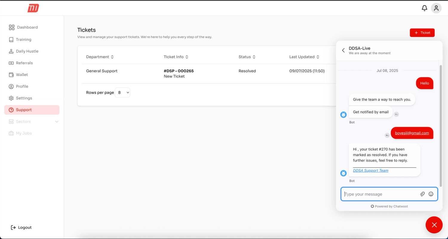
Introduce Support
Field agents are everywhere, Since anything could go wrongly, introducing support from lunch means, I as the solo developer can focus on what matters.
Learning
DDSA taught me that design and engineering problems are often two sides of the same coin. Fragmented UI usually signals fragmented code, and fixing one without the other only gives partial results.
I learned the value of context, for users and developers alike, and how a single source of truth, clear governance, and iterative improvement can transform both the experience and the product.
The project also reinforced the importance of scalability. Solutions should not just solve today’s problems but also make future growth smoother.
Conclusion
DDSA started as a fragmented product that frustrated both users and developers. By approaching the problem with an iterative framework and combining design thinking with engineering execution, I helped transform it into a modern, unified application that is faster, easier to use, and ready to scale.
Thank you for reading.
On This Page
- Problem Overview
- Solution Process
- Measure
- Analysis & Insights
- Design Insights
- Code Insights
- Change
- Changing the design
- 1. Systemising the Design
- 2. Improving Find-ability
- Changing the Code
- 1. Tooling & Tree-shaking
- 2. Context Synchronisation
- 3. Modern Practice
- 4. Improving Navigation
- 5. Cleaner Code
- Outcome
- Improvements
- Improved Performance from 12% to 92%
- Improved user context synchronisation
- Improved User Onboarding
- Improved Onboarding Documentation
- Change Request
- Introduce Training for Agents
- Introduce Support
- Learning
- Conclusion